Services
Hello! In our experience working with companies from different industries optimizing their website for conversions we have often encountered this concern in managers and marketing managers, they see that the visits are at peak on their website but conversions are not directly proportional to the number of visitors browsing their digital assets.
It is difficult to understand why this happens, so today we want to share with you one of the main reasons that in our experience causes this very serious inconvenience for marketing managers, since we know that their work is directly reflected in results.
Let’s start to unpack the topic by asking ourselves the following question : does my website really convert? Let’s review analytics, we know that data is the most accurate thing we have, let’s open Google Analytics and quickly see what is our conversion rate for the last 3 months. If your rate is less than 10% we have a problem.
We hope these tips will be of great help to you:
A page can be pretty, fast and full of effects… but if it does not respond to a clear business objective, it is likely that the user will not know what to do on it.
👉Ask yourself the questions: Does your website guide the user to an action? Is it optimized to generate leads?
Many websites fail not because of what they have, but because of what they lack: direction, intention and clarity.
A common misconception is that UX is only visual design. In reality, it encompasses much more:
A bad UX doesn’t always scare the user away right away. Sometimes, it simply doesn’t motivate them to click. Carefully review the UX of your landing pages.
A button that says “Submit” instead of “Request your free advice” can lower your conversions without you even realizing it.
Google repeats it every year: if your website takes more than 3 seconds to load, more than 50% of users abandon it.
And yet, many companies do not optimize images, code or hosting. Imagine that!
A nice design is no good if the page feels heavy or slow. The user does not wait.
From Apros, we recommend measuring your Core Web Vitals with tools like PageSpeed Insights or Lighthouse. Have you done it lately?
A site without clear calls to action is like a store without a salesperson. Worse, there are sites that have buttons, but no real call to action.
💡 A good CTA is not just a button. It’s a well-guided micro-decision:
There are companies that write with SEO in mind… but not with the user in mind. The result: well-positioned pages that don’t convert because they don’t answer the right question.
Ask yourself this question: 👉 Does my content solve what the visitor came looking for or does it force them to keep looking elsewhere?
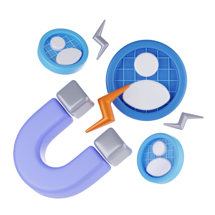
The only way to detect these leakage points is with a comprehensive audit: technical, UX, content and performance. At Apros we don’t just make beautiful sites: we analyze with a magnifying glass how to improve their real impact.
Your website doesn’t need more visitors. It needs to convert better.